
Blog Posts
Blog Post 1: Header & Image Editing
My header image sets the tone and my overall interests for my website by showing a blend of business professionalism and digital media culture. The background photo of people in a modern office overlooking a city gives the site a professional, career‑focused feel, while the transparent overlay of social media icons signals that my interests and experience are connected to communication, technology, and online culture. Since my target audience includes classmates, professors, and potential employers, the image helps communicate that I’m someone who understands both the professional world and the digital tools that shape it.
For my images, I made sure to use sources that allow reuse and modification. The social‑media computer graphic came from Google, with a Creative Commons licensed image by Joseph Cosgrave titled The Unspoken Reality of Social Media Advertising, which is free for commercial use. The background image came from Unsplash, taken by Charles Forerunner, titled Meeting Near a Transparent Glass, which is also free for commercial use and allows modifications. Both platforms clearly state the licensing terms, so I know I’m allowed to reuse the images legally.
To create the final header/multi-layer image, I followed the directions in James Hodges’s tutorial video by using the software Pixlr. I placed the business photo as the base layer and then added the social‑media image on top. I adjusted the opacity to make the top layer transparent so the two images blended together. This relates to Manovich’s point about how software like Photoshop relies on layers to let users stack, modify, and combine visual elements in ways that traditional media can’t (Manovich 2). Even though I wasn’t using Photoshop, the same logic applied: layers gave me control over composition and allowed me to create a more polished, intentional design.
Compared to a single‑layer bitmap image like the ones Davison describes in his discussion of MS Paint, my process was much more flexible. Davison explains that bitmap programs rely on direct pixel manipulation, which often leads to rough edges and visible “jaggies” because everything is drawn on one flat surface (Davison 285). On the other hand, using layers meant I didn’t have to redraw anything manually. I could move elements around, resize them, and adjust transparency without damaging the rest of the image. So while MS Paint forces you to commit to every stroke, modern editors let you build an image piece by piece, which makes the process cleaner and more forgiving.
Blog Post 2: Screencast Tutorial Video
Screencast Tutorial YouTube Video Link: https://www.youtube.com/watch?v=xoTd2ONkzgY&t=30s
This video shows how I made a short USA gold medal TikTok‑style edit using the Videoshop app on my phone. I walk through how I added clips of Jack Hughes’s interview, Team USA’s celebration moments, and the song “Love Me Again” by John Newman to create a clean, emotional highlight edit. The purpose of the tutorial is to help beginner editors and hockey fans learn how to put together a smooth sports edit by watching the process step by step. My audience is mostly students and sports fans who want to make better TikTok or Instagram edits but may not know how to sync clips, choose the right moments, or match everything to the music. I also explain why certain clips work better than others and how matching the beat of the song to the action makes the final edit feel more exciting and professional. By showing the entire process on screen, viewers can see exactly how I build the edit from start to finish.
I expect users to find my video through YouTube or Instagram search, especially people who keep up with the Olympics, hockey highlights, or TikTok-style sports edits. Wolf explains that people usually find videos by searching for something very specific they want to learn, and they often choose videos that feel “straightforward” and interesting to them (Wolf 2). She also notes that viewers trust videos where they can actually see the process happening because it helps them judge whether they can do it themselves. That idea fits my tutorial perfectly, since I show every step inside the app instead of just describing it. Wolf also talks about how people prefer videos made by creators who feel relatable or similar to them, which is why simple, clear tutorials tend to perform well. My video matches that pattern because it’s made for regular viewers who want to learn a quick editing skill, not experts. Since the topic is easy to follow and connected to a big sports moment, I think viewers will find it worth watching and helpful for making their own edits.
Here are the links for the Videoshop app and the YouTube videos I used for this Screencast:
Videoshop: https://apps.apple.com/us/app/videoshop-video-editor/id615563599
YouTube Videos:
Blog Post 3: Final Project Podcast
For my final podcast project, I created an interview-style podcast focused on food insecurity and how it impacts athletes and students. This connects directly to my interest in sports media, since the media plays a big role in what issues get attention and which ones are overlooked. Food insecurity is not something often talked about in sports, even though it can have a major effect on performance, recovery, and overall health.
In this episode, I sat down with John Varghese, a former volunteer at Hands of Hope Food Pantry. We talked about his experience working there and what he saw firsthand when it comes to food insecurity. A big part of our conversation focused on how not having access to enough food can affect someone’s energy, focus, and overall performance, especially for students and athletes. From a sports media perspective, this is important because these kinds of challenges are rarely highlighted, even though they directly impact how athletes perform.
Hands of Hope Food Pantry is a nonprofit based in Edison, New Jersey, that works to support individuals and families facing food insecurity. Through our discussion, it became clear how much of an impact organizations like this can have on a community, especially for people who rely on consistent access to food. You can learn more about them here: https://handsofhopefoodpantry.org
Overall, this project helped me see how sports media can be used to bring more awareness to issues like food insecurity. By sharing real stories and experiences, media platforms like podcasts can help people better understand how something like nutrition connects to athletic performance and why support systems like Hands of Hope are so important.
Group Members & Links:
John Varghese – https://sites.google.com/view/thefitnessroom/
Angelina Shen – https://as5050.wixsite.com/angelina-shen
Esha Mohite – https://eshamohite2.wixsite.com/eshamohite
Sai Abhinav Ledalla – https://sailedalla.netlify.app/
Caitlyn Lupton – https://crl157.wixsite.com/caitlyn-lupton-person
Background Music for PSA: “Inspiring Piano” – AudioCoffee (Free Music Archive, CC BY)
Artwork image credit:
Taekwondo4Fitness
Source: taekwondo4fitness.com/healthy-food-supplements
Blog Post 4: Memes


Memes are everywhere online, especially in sports media, where quick visuals grab attention fast. For this post, I chose three memes, Distracted Boyfriend, Exhausted LeBron James, and “This Is Fine” dog, and connected them to my topic of food insecurity and how it affects athletes and students. These memes may seem simple, but they help explain real issues in a way that is easy to understand, especially for sports fans and student-athletes.
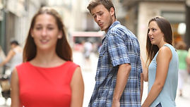
The Distracted Boyfriend meme is all about focusing on the wrong thing. In sports media, this can show how athletes are drawn to quick options like junk food instead of proper nutrition. Davison explains that “the ideal of a meme is the concept or idea conveyed” (Davison 5). Here, the idea is distraction and bad priorities. According to Know Your Meme, this meme comes from a stock photo and spread as people relabeled it. The version I use shows an athlete choosing junk food over proper nutrition, while other versions use different labels.
The Exhausted LeBron James meme connects to athletes because it shows burnout. It reflects physical and mental exhaustion, which can relate to not having enough energy during games and training. In sports media, this image is often used to show performance struggles without talking about deeper issues like nutrition. Davison also explains that memes spread through “observation and learning” (Davison 3). According to Know Your Meme, this image spread through sports culture and reposts online. The same photo is used, but the meaning changes based on captions.
The “This Is Fine” meme is about ignoring a serious problem. Davison describes the ideal as pretending everything is okay when it is not (Davison 5). This connects to how food insecurity is often overlooked in sports. According to Know Your Meme, it comes from a webcomic and spread widely online. My version shows athletes dealing with problems that are ignored, while other versions apply it to different situations.
Overall, these memes show how humor can communicate real issues and help sports fans better understand how food insecurity affects athletes.
Blog Post 5: Course and Project Takeaways
As I finish up my Strategic Presentation course, I can honestly say I learned a lot more than I expected. At the beginning, I thought it would mostly be about giving presentations, but it turned into something way bigger. Through projects like my final project with the Hands of Hope Food Pantry and building my website, The Sports Media Hub, I learned how to communicate in different ways and connect with an audience more effectively.
One of the biggest things I’ll take away is learning how to build and manage a website using Wix. I had never really made a website before, so at first it felt confusing. Over time, though, I started to understand how everything works and how important design is. I realized that people don’t just care about the content; they also care about how it looks and feels. My Sports Media Hub now shows who I am, what I’m interested in, and the kind of work I’ve done, which is something I’m actually proud of.
Another thing that stood out to me was working with audio using Audacity and SoundCloud. Editing audio was something completely new to me, and it made me realize how much detail goes into it. Things like background noise, pacing, and tone really matter. It also showed me how different communication can be when there are no visuals and how important it is to keep people engaged just through sound.
The most meaningful project for me was creating the PSA for Hands of Hope Food Pantry. It felt different from other assignments because it had a real purpose. I was not just completing something for a grade; I was trying to spread awareness and make people care. That experience showed me how powerful communication can be when it is done right.
Overall, this class helped me become a better communicator and gave me skills I know I’ll use in the future, especially in sports media. It made me more confident in sharing ideas and showed me that how you present something can be just as important as what you are saying.